Switch 开关
表示两种相互对立的状态间的切换,类似 Element Plus 的 Switch 组件。使用 QPainter 自绘,带有丝滑的滑动动画。
基础用法
from monkeyqt import MkSwitch

switch = MkSwitch(checked=False)
switch.toggled.connect(lambda state: print(f"开关状态: {state}"))
默认选中
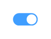
switch = MkSwitch(checked=True)
自定义颜色 &
# 自定义激活颜色(默认蓝色 #409eff)switch = MkSwitch(active_color="#67c23a")   # 绿色

# 自定义未激活颜色(默认灰色 #dcdfe6)switch = MkSwitch(inactive_color="#f56c6c")  # 红色
自定义尺寸 &
# 默认尺寸: 40×20
switch_default = MkSwitch()

# 大号开关switch_large = MkSwitch(width=56, height=28)

# 小号开关switch_small = MkSwitch(width=32, height=16)
代码控制
switch = MkSwitch()

# 代码设置选中状态switch.setChecked(True)

# 读取当前状态print(switch.checked)  # True
API
构造函数 &
MkSwitch(checked=False, active_color="#409eff", inactive_color="#dcdfe6", width=40, height=20, parent=None)
| 参数 |
类型 |
默认值 |
说明 |
checked |
bool |
False |
初始选中状态 |
active_color |
str |
"#409eff" |
激活(开启)时的背景色 |
inactive_color |
str |
"#dcdfe6" |
未激活(关闭)时的背景色 |
width |
int |
40 |
开关宽度(像素) |
height |
int |
20 |
开关高度(像素) |
parent |
QWidget |
None |
父组件 |
Signals
| 信号 |
参数 |
说明 |
toggled |
bool |
开关状态变化时触发 |
Properties
| 属性 |
类型 |
说明 |
checked |
bool |
读取/设置选中状态 |
方法
| 方法 |
说明 |
setChecked(bool) |
设置选中状态并触发动画 |